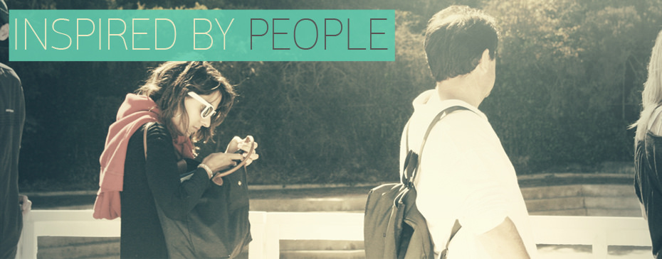
Inspiration is just around us
My inspirations
I believe that the best inspiration for designers is what they are able to observe around them. And the better of an observant they are the better inspirations they can find. I personally like too look into how people live and interact with other people, objects and services in daily life. it is amazing how much you learn by just taking time and observe things around you.
Other sources of inspirations are always available on the internet, but the inspiration I believe helps me design an experience takes some time and attention. I will be looking for inspirations throughout this project towards the end. That is one of my goals in this project to design an experience that is addressing the needs of the users.
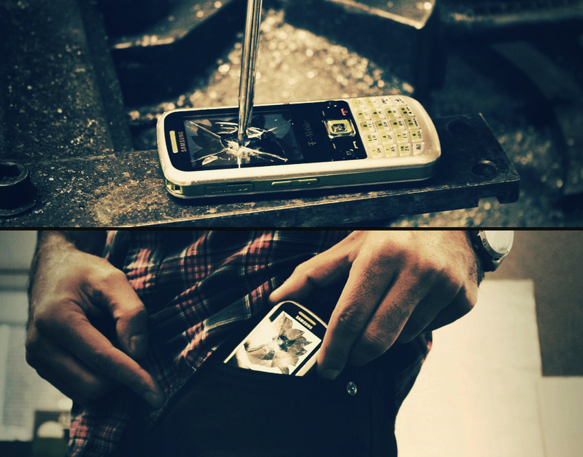
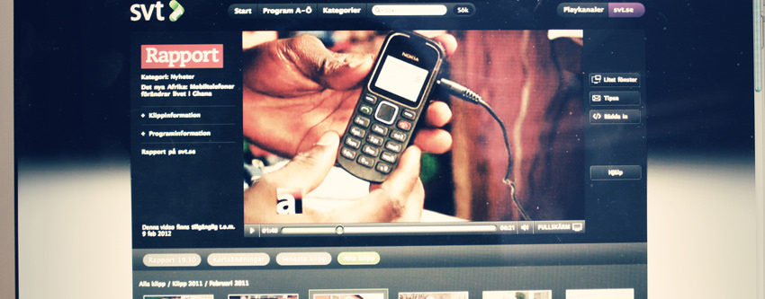
When the visual display is gone!
An experiment with my old phone
I did this experiment for two reasons: to see how a phone would be like if we just destroy the screen and also to see how it feels if you damage the phone you have been using for a while. I was using this phone while I was in the US. I never felt like that the UI was actually designed for the needs of the users. After moving back to Sweden I took the opportunity to smash the screen and try to use the phone for a bit. I have to admit that is was frustrating as I could barely follow the steps to get into my phonebook but was never able to make the right call. I could hear that I received messages but could not check them. The device became more of an output device.
The interesting part was that since I knew there is not much I could do with phone, I was trying to find alternative ways of getting in contact with my friends and make sure I am not missing out on anything. Also this short experiment helped me think of other ways to actually interact with the phone and what would be the benefits if we knew there is no screen that can distract us. The more I spend time using my destroyed phone the more I could appreciate the non-visual basic interaction with the phone. Even though I did not have access to even some basic task on my phone still I felt I am more engaged into the work around me. Because there was not much I could do about the phone.
That was also a point where I realized that we don’t need to actually have a phone that size and with that shape. I also came to realization that when you take the proper communication away from a mobile device, you can think of it as a device that could be used for other things rather that connection with other people.
Some people gave me a hard time that destroying a phone is not good for the environment and I could have still used the phone! well I simply dont care!
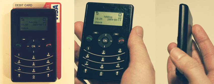
Finally I got the world’s simplest phone!
Downgrading to a basic phone
It has been a while since I started looking for a very basic and simple phone. I came across this phone after several days of search on the internet. This phone is claimed to be one of the most simplest, smallest and slimmest phones in todays market. Simpell is the Australian company that manufactures this phone along with some other basic models. The phone is actually smaller that a credit card and is only 9 mm thin!
I started using the phone right after I got it in the mail. first thing I noticed was that there is no Vibration mode so I just needed to put it in mute everytime I was in a meeting. I actually found that to be a cool thing as I was totally detached form my phone when I could not answer it. The UI is so simple that I actually enjoy using it. I have few options in each part of the phone and that requires less thinking!
Screen size is just perfect for what I need for a phone. The small size of the phone is another thing I like very much because I can just put it in my wallet! and when in my pocket it dose not feel that i am carrying a phone at all. What I miss with this phone is the vibration and also the battery life!
It is amazing how people react to this phone. Some think that this is just a calculator nota phone!
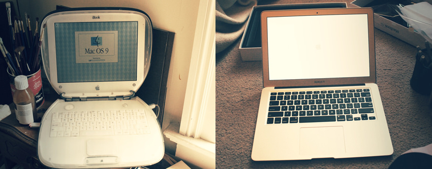
How fast are we moving forward?
Computers are evolving slowly!
When I got my hands on the new macbook air, the first thing I did was a quick comparison with the older iBook that my landlord still keeps in his painting room. I is amazing to see how things have been changing in the last 10 years and to think of where we are moving with the new technologies. products are less abut how they look or feel and more about what you can do with them. The Experience!I actually like the the way older iBook looks more than the new macbook air. But just thinking about what I can get done with the new macbook just makes me realize how small changes in the interface can make an experience more meaningful. Maybe it is all about those tiny details that designers tend to miss.
One other thing that I learned by looking at these two products was that, using the new technologies dose not necessarily mean that the new experience would be better. You can create great experiences with the technologies from 20 years ago!as long as you design it for todays needs!
Mobile devices in developing societies
Innovation using simple tools
The number of mobile today is way more than the number of people that have access to computers. This is especially the case in developing countries where there are part of the society that can not afford computers. I believe this is where designers can think of democracy and hoe to make new services available to more people.
I watched this documentary of Swedish TV. showing how simple mobile phones could be used for some pretty advanced banking transitions. Something that is happening today in developed countries using internet and computers. They are using simple GSM phones and text messaging to confirm transitions. This to me is a great opportunity to use mobile devices for tasks that we alway design to be for computers.
What is we could actually design a system that worked with any kind of mobile device and was free to everyone!
Humanizing mobile devices
A design project by Julius Tarng
I came across this student project by Julius Tarng. It is an interesting approach to the design of mobile device. I really likes the points he is making in this project and the way he came up with design solutions. You can see his portfolio here:Some of his point here: http://tarng.com/#project-modai
-Current mobile devices are chunks of metal and plastic that end up in a landfill.
-Humans adapt themselves to use electronics, making the relationship unnatural and sterile.
– Just a tool Modern phones are easily-replaced. Relationships are simply utilitarian and monetary.
How can we change this:
-Trusting bond:An emotional connection that turns the device from a tool into a trusted companion.
-Human interactions:New ways to use your device, inspired by human behavior.
-Sustainable ecosystem: Scrap the planned obsolescence model and plan for upgrades.
-Enforce emotional connections by humanizing the interactions. I think it is very interesting to look at a mobile device in this way and in the Project Modai, there are some interesting ideas on how to have natural human like interaction with the device.
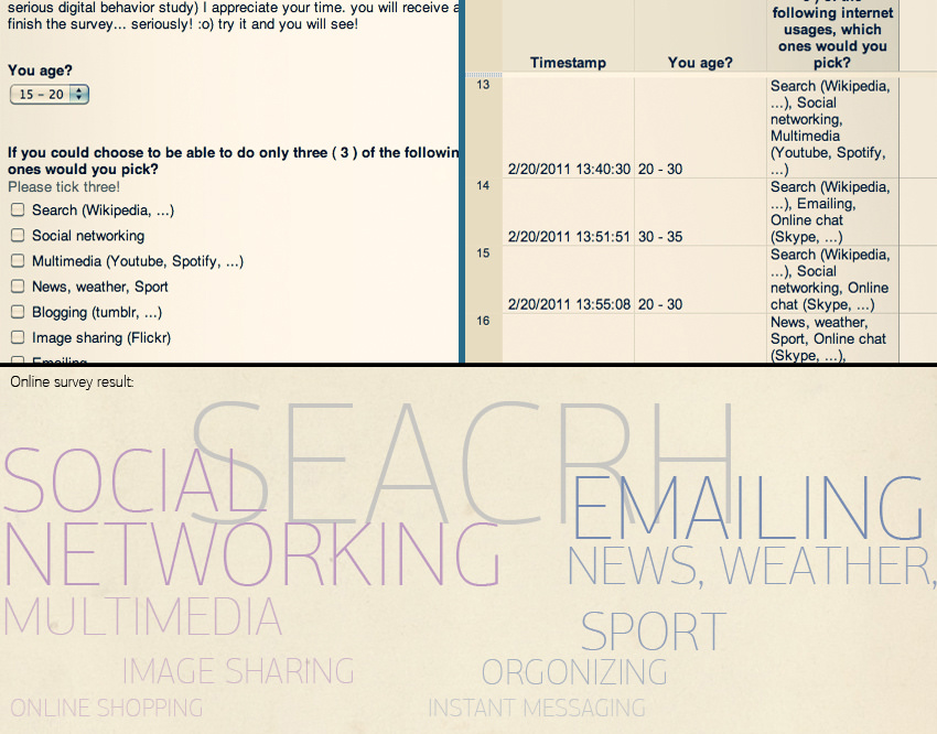
Survey on digital behavior
An online survey to get inspired
In order to better understand the digital behavior of the users I did an online survey in which I asked users to indicate the type of digital behavior they are mostly involved with. The result of the survey was meant to be an inspiration for how I see the users. I twas very interesting that I could simply group the digital behaviors into two categories. One group the ones that are more into social networking and multimedia and the other group are users that are their digital life is more about using email to communicate, check the news and sports. For the first group the digital life is combined with their social life more that the second group. This much of information was enough for me to know which group if users I am design for.
raft and digital
Hand made iPhone covers
I saw this hand made iPhone covers in an exhibition in Stockholm. What made me really become interested in them was the fact that this is all being done by hand and works well with such a hight tech device. Putting such a skin on an iPhone changes the whole identity of the iPhone in a way that is more attractive to the user as it has less of the technology visible. I have been heavily inspired by this beautiful craft. I believe that the technology can be less visible if we design it to look and behave more craft!
Emotional design
The missing feeling
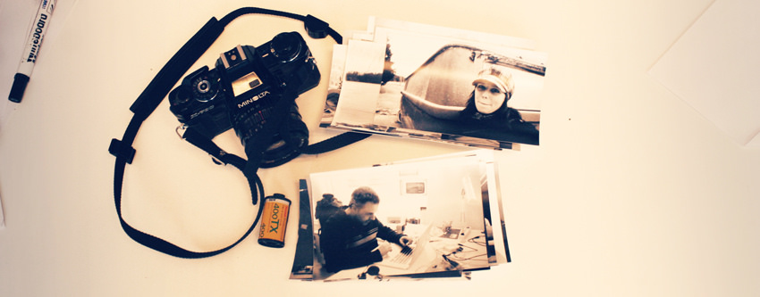
Digital, Digital, Digital! I stared using my old film camera because my digital camera is not giving me what I want. yeah sure I can take cool photos with it and look at them instantly, edit them and then post them on my blog! but there is something missing in the new digital experiences. Isn’t that the emotional part of it?
“Attractive things make people feel good, which in turn makes them think more creatively. How does that make something easier to use? Simple, by making it easier for people to find solutions to the problems they encounter”. Donald Norman, in his book “Emotional Design” introduces the three levels of engagement with the products and experiences: visceral, behavioral, and reflective. The visceral response is our first gut reaction to things. The behavioral aspect of response is the brain’s response to the pleasure and effectiveness of use of a product. Finally the reflective aspect of our emotions is associated with long-term response — memories provoked by a certain object. I my case with the film camera I believe the reflective part was the strongest connection that made me use my film camera again. How do we create the same feeling with a mobile device. a device that normally last for a year or so and keeps advancing at the speed that is is even hard for designer to catch up with?
What happened to the old-new technologies?
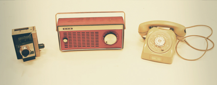
Things I found today
I found these products today at school. I was so happy to have the chance to touch them and remember old days. The era when the new technologies became accessible to the public, the time when we moved from craft to analog, has something very special in terms of design. The integration of technology and what human-being was always used to for hundreds of years ended up in some beautiful products and experiences. Those products disappeared shortly after and now we are dealing with some plastic and digital touch screens. But where is that emotional connection? Of course that connection is not missing but has changed its form. A new form that might not be as strong as the initial experiences. I believe, as a designer, it is always interesting to be inspired by the emotional values that we could find in old products. Maybe there is a way to recreate them today!
Lets see what people think
Umea open house an opportunity to talk to people
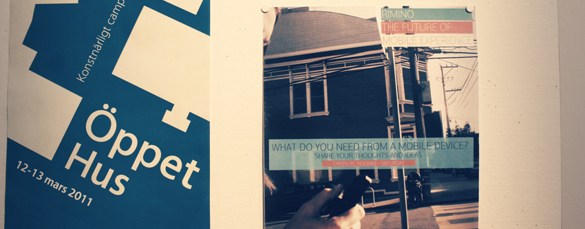
Umea Art Campus open house is an opportunity for Umea residents to come to the design school and see what is happening in the school and talk to the students and staff. We were given the opportunity to actually talk to people and have small workshop/brainstorming with them. I made this poster and am looking forward to the weekend when I have the chance to ask people what they think about their future mobile experience.
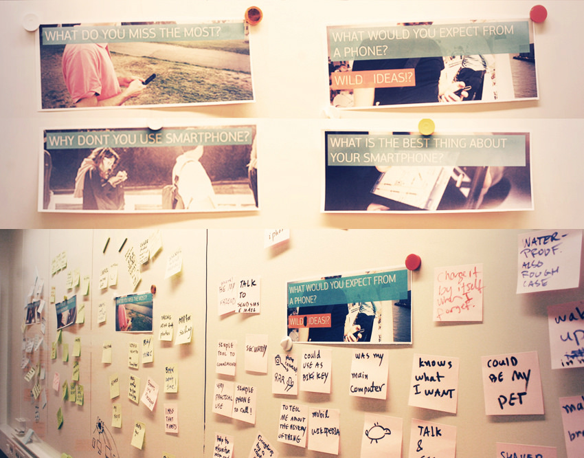
Involving the users in design
engaging the suers in ideations
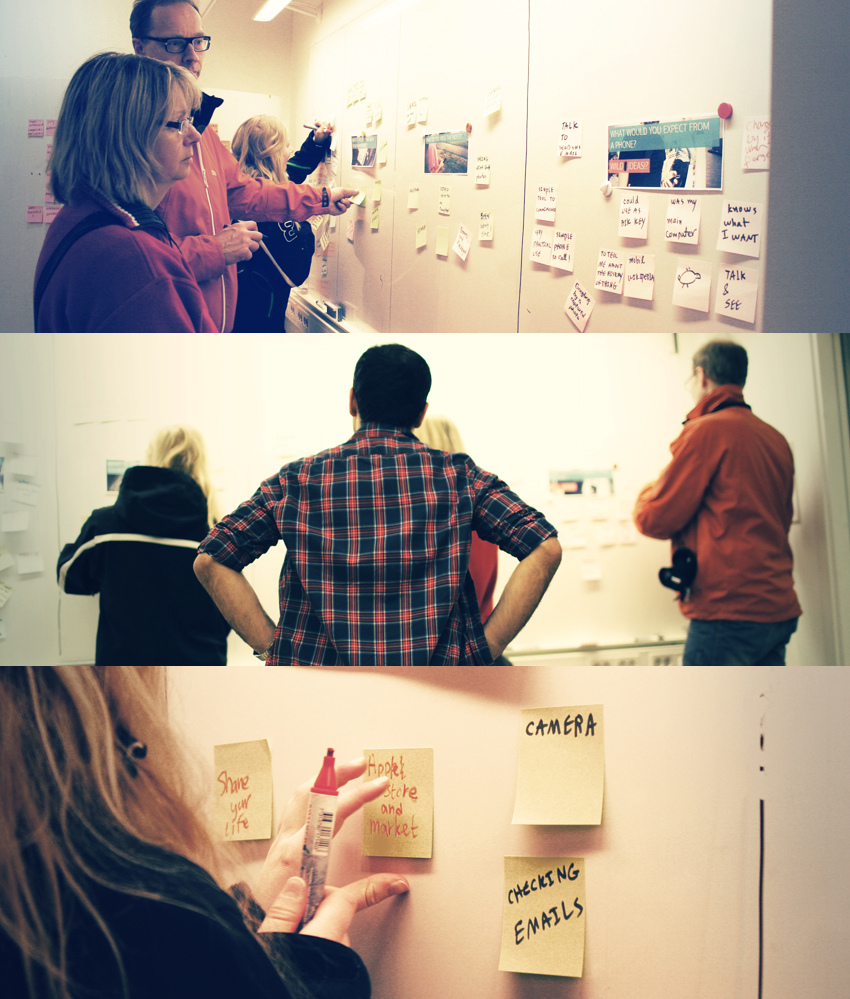
During the 4 hour long workshop in the Umea Institute of Design I had the opportunity to meet many interesting people with different backgrounds and opinions about technology. I set up a board with four different topics:
1-What do you miss the most about your phone.
2-Why don’t you use smart phone?
3-What is the best thing your phone?
3-What do you expect from a phone?
My intention with using these topics was to open up discussions about the real needs and the feelings of the user at the same time let them use their imagination and uncover their desires. I asked them to put their honest opinion about what they need and what they think about smart phones. The people I had the chance to involve in this workshop were mostly the people that I consider in my user group as being less of a tech savvy and more of essentialist.
Finings from the users users
When users have a chance to directly influence the design
The most interesting thins about this workshop was what I learned about involving the users in ideation and how you can actually encourage users to be open and honest about their needs and desires. Especially in such context and with these kind of topics it might be a bit hard to make users comfortable and easy to express themselves.
The most valuable finding from this workshop was what stops users fro using todays smart phones. Basically what is not attractive to this target group about the smart phone: 1-They don’t see the need
2-It is expensive!
3-They don’t want to manage another device.
3-It dose not replace the laptop!
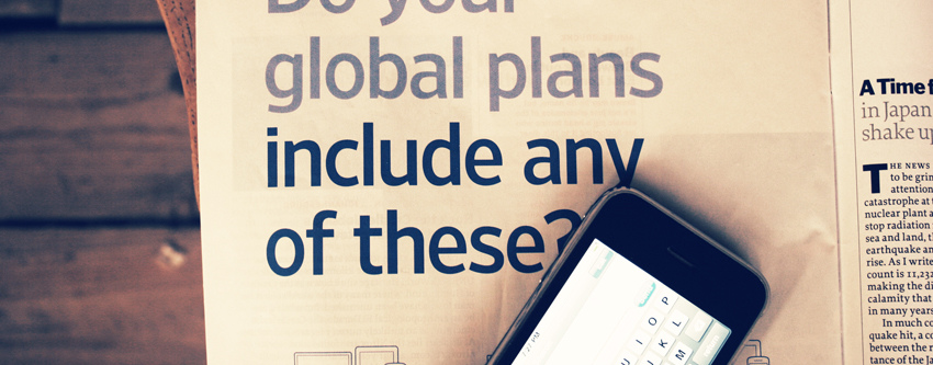
Why LCD?
Cant we just use paper?
I was totally fed up with all these new high resolution screens that look super sharp! Do we really need that? seriously. While in Copenhagen,I just reached to the table in the hostel to pick up my phone and looking at the screen of my phone and the magazine I was reading earlier, i just could not stop thinking how it would be if my phone UI would have looked like the magazine on the table. That was the spark that made me decide to use e-paper on the concept device instead of the LCD.
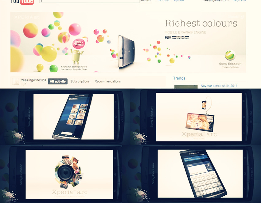
Seriously is that what we need?
New phones richer technologies and what?
So I think this ad on youtube from the new Xperia phone helped me realize how corporations want to make users believe that the richer and more high tech devices that can do crazy cool stuff are cooler! But seriously, am I gonna get into this and design something cool for the users that has the craziest motions and graphics. Dose that make the experience better? Do users really need this? Why cant we just think of what we need as apposed what we can do?
This Ad pissed me of so much that I made my final decision, well based on what the user group I am designing for needs of course: I don’t want to add another device that has this cool touch screen and all these cool motions and animations. I think there are lots of them that are good entreatment and distraction for us! I am limiting the technology and see this as a challenge how you can get still make a rich experience. E Paper it is!
UI for e-papar
Inspiration for UI graphic language
Designing a user interface foe an E-Paper device quite new as there has not been a device out there that uses a color e-paper as output. The best source of inspiration for this UI would be the print. It makes better sense to have an interface that is not made of glassy icons and feels more like a print paper. Also the UI behavior on E-Paper would be more natural if there is no strong motion within the UI. This makes the UI design a bit challenging as motion and animations are giving a whole new meaning and feel to the Interface on screens. This would be a challenge for me to design an interface that has minimum motions in it. To replace the lively motions in the interface, I suggest using strong visual elements that communicate with the user in a passive way, the way posters or book covers are designed. I would like to call this interface a “poster interface” where every stage of the UI seems like a poster on the device.
Poster UI
Design elements in posters
What makes poster a poster? The interface for this concept device would have the look and feel of a poster as it will have the same way of communicating the content with the user. In order to bring that feel into the UI, I summarized what is found important in the graphic language in posters.
Type layering: the way types are used in different sizes, colors and opacity to break the message into layers that users would understand at different levels they need.
Heavy typography: It is interesting how typography is being used in posters as the main and strongest element. The freedom of using the types in size and thickness that might not look like what we expect from a UI still a great way to make the e-paper UI more meaningful.
Strong visual elements:Posters are designed to catch the attention from distance and make people feel interested to read them. That is one of the reasons that strong visual elements in posters are the key to their visual language.
Background color and patterns: The use of strong colors and backgrounds in posters to catch the attention and make the types and visual elements stand out.
Distracting layout: What we see in many posters is that the more distracted the layout the better the poster works for its purpose, breaking rules to make the experience different.
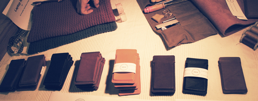
Craft look and feel
Instead of plastic and glass feel
I was that close to start working on the 3D CAD model and just hesitated. I think it was what I felt about using the modeling program, rapid prototyping machine and the painting tools I was planning to use. Perfect and shiny surfaces, glossy color and accurate dimensions, I felt that this is not what this experience is about. There is something nice about a craft feeling to the product. By using paper instead of the glass screen, the form factor and material could be different form what todays electric devices are.
Looking around for some inspiration, I came across this old notebook with leather cover. While holding it in my hands I really enjoyed the feeling and what I could see in the product. A mobile device dose not need to be made of plastics and glasses, and dose not need to be a perfect shape that represent the technologies in 2015! Technology would appear more desirable and beautiful when it is integrated with the craft. I was suer at this point that this product is gonna be totally handmade craft our of leather and paper.